Case Study : Miele Brand Decks
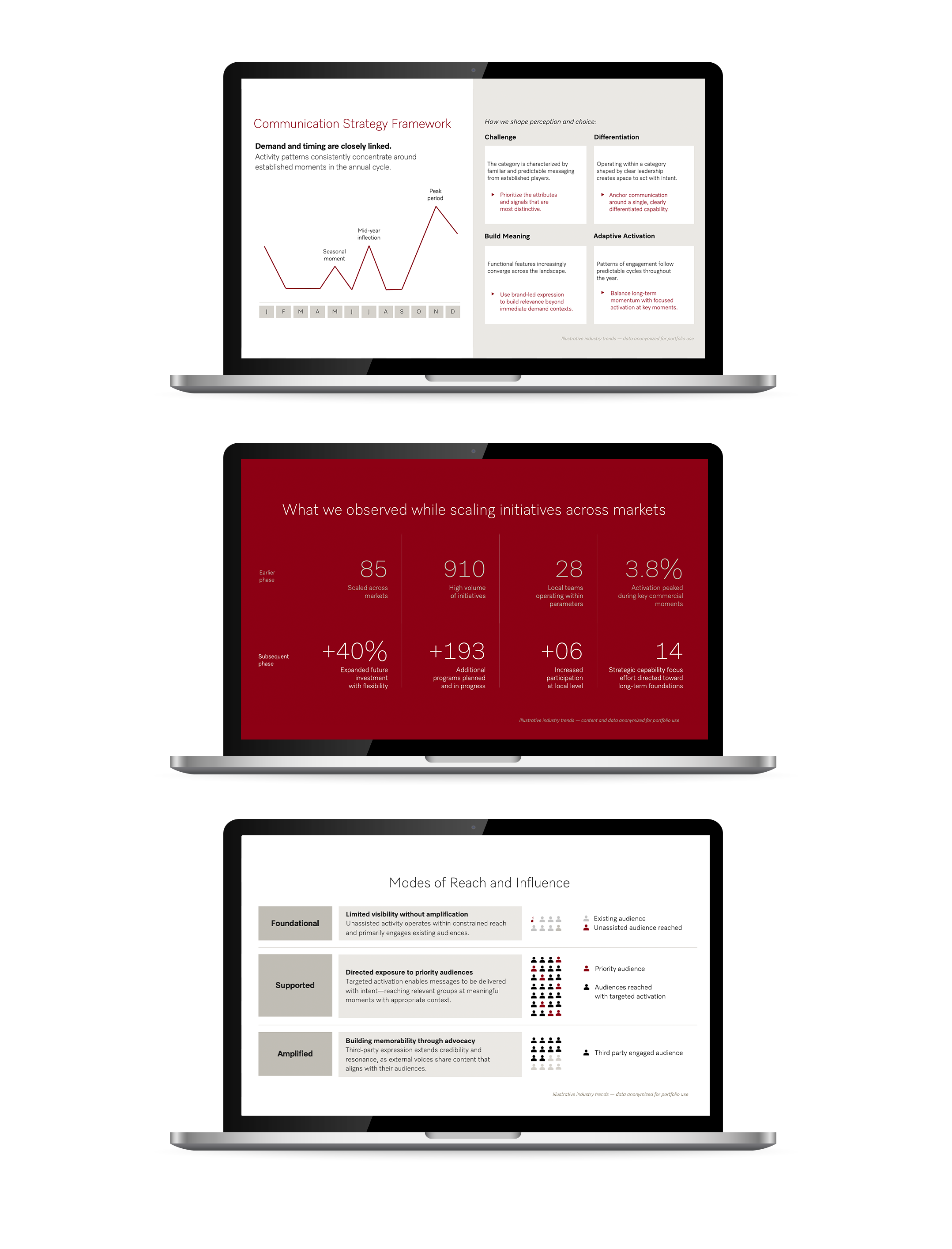
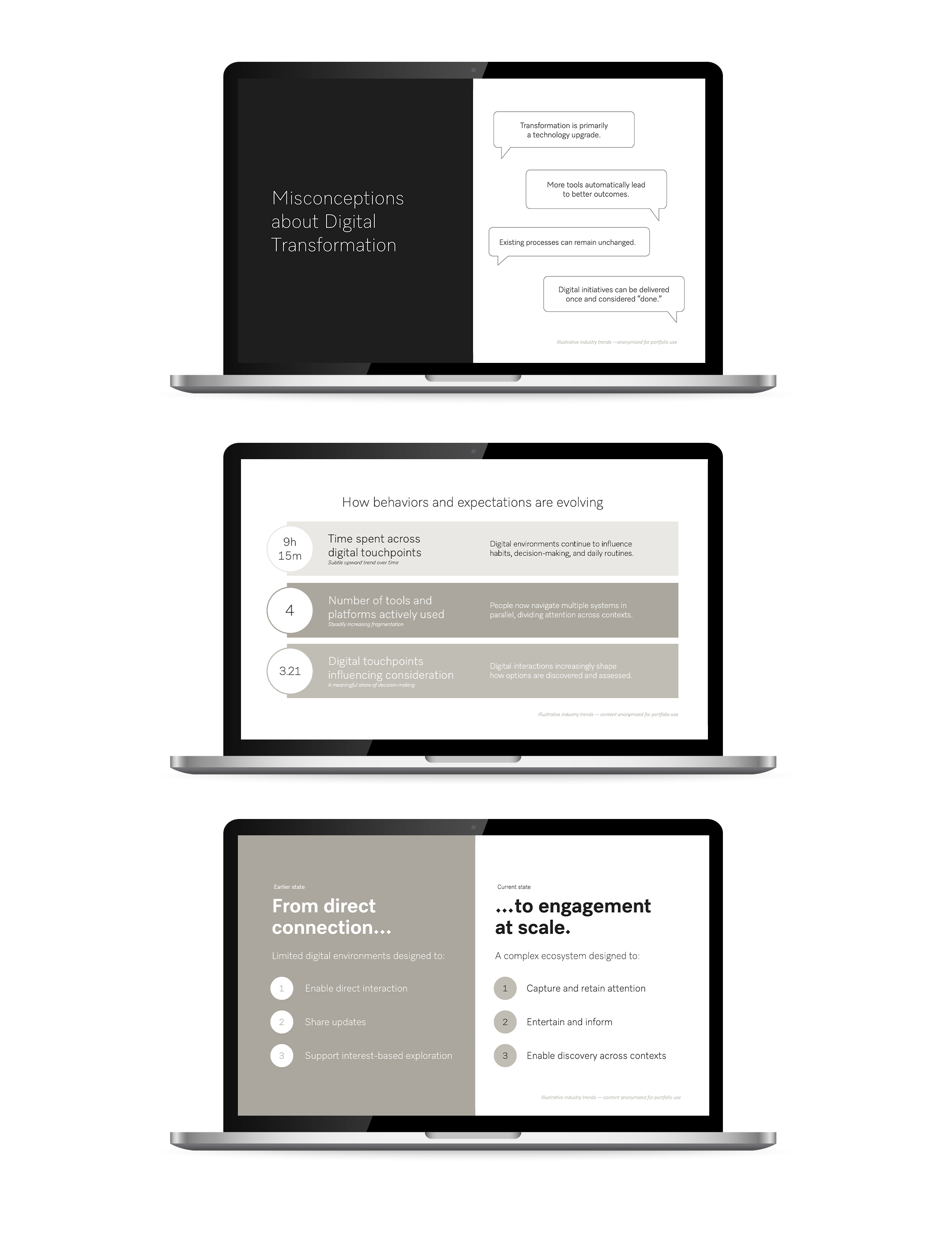
Clear, effective visual communication is critical for an internationally known company like Miele. When the Marketing Team brought me in, their challenge was that a set of internal presentation decks had grown fragmented over time, each slightly misaligned in style, layout, and tone. My initial project was to update and standardize a set of internal decks, then unify them into a single, cohesive presentation for a global summit.
This meant working carefully with Miele’s established brand design guidelines, and applying them with precision and intention where the previous decks may have missed the mark. The goal of this suite of decks was to make them feel like they originated from the same place, regardless of the source material.
Following the success of that project, the team continued to engage me for both internal and external presentations. With the solid foundation of consistency in place, I’ve been able to take the content to the next level, whether it be through thoughtful animations, transitions, or interesting text effects, which adds personality to the professional and expands upon existing global brand standards. The result is presentation decks that feel like Miele, but with extra intention, polish, and energy.
Designer: Madeline Kelly
Client: Miele Marketing Team